Table of contents
- Why “Good Website Design” is Important in 2024?
- 10 Latest Website Design Trends to Know in 2024!
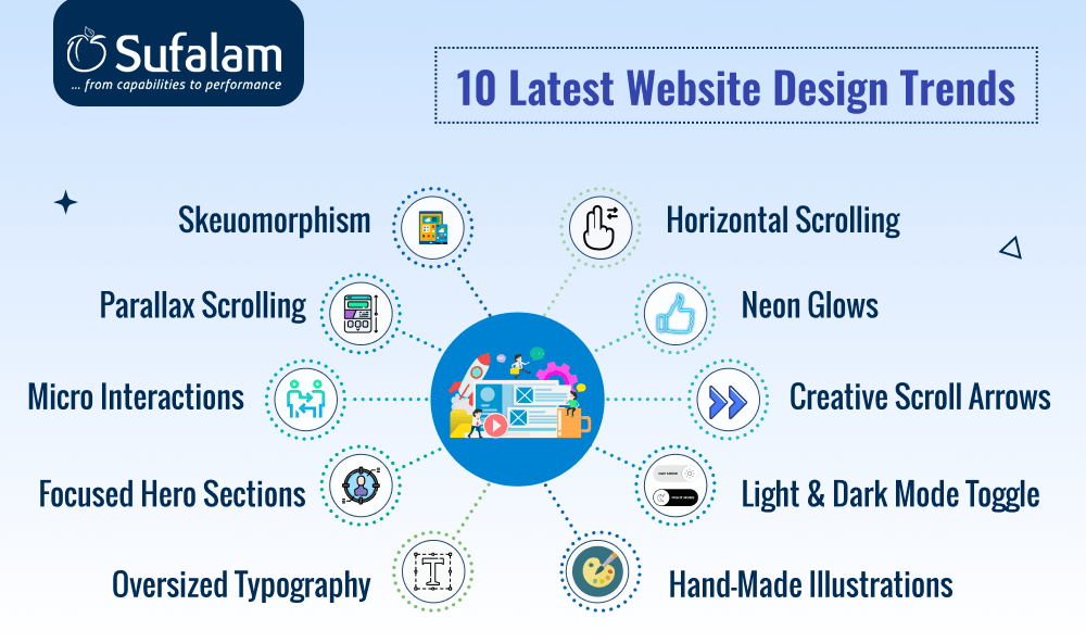
- 1. Skeuomorphism: Where Designing Meets Reality
- 2. Parallax Scrolling for Much-Needed Depth & Dynamics
- 3. Micro Interactions for added intuitive interaction
- 4. Focused Hero Sections to Grab The Attention
- 5. Oversized Typography to catch users' attention!
- 6. Go Unique with Horizontal Scrolling
- 7. Neon Glows for Enhanced Glow on the Website
- 8. Scrolling Becomes Fun with Creative Scroll Arrows
- 9. The Blended of Light & Dark Mode Toggle
- 10. Be Real with Hand-Made Illustrations
- To Conclude
- Frequently Asked Questions
Web design is no longer limited to creating visually appealing pages. Rather, it's about creating experiences that connect, attract, and motivate. But, web design is dynamic and is constantly changing. Just when you know that you have designed a great design, a hot new website trend emerges in the market.
With new technology constantly emerging and a greater focus on user behavior and engagement, the 2024 trends are poised to rethink how we approach digital website design as well as the functionality of the website.
Utilizing the latest website design trends can assist you in employing the most recent techniques to satisfy user needs. Also, at the same time - you should not jump to every new trend that emerges in the market, you need to thoroughly analyze which trends will be most advantageous to your specific users and brand.
If you are wondering about the latest web design trends to revamp your website, then this article will walk you through why a good website is important and the best website design trends of 2024.
So, let’s jump in!
Why “Good Website Design” is Important in 2024?
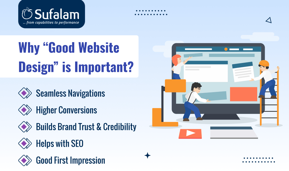
Seamless Navigation
Users don’t have the whole day to find the information they want on your website. They just take a few seconds or minutes. If they didn’t get it or found it confusing - they will leave.
Good web design ensures a seamless navigation experience, which is essential for ensuring that visitors can easily find what they're looking for on a website. A well-designed website features a logical structure, intuitive navigation paths, and clear, easy-to-find information. It enhances user satisfaction and contributes to effective user engagement and retention.
Higher Conversions
The sole reason behind making a website is to inform customers about who you are and what you do, to build that initial trust and reliability in the website - which can lead to conversions.
Users make decisions about staying on the website and browning further within the initial 3 seconds, so you need to make the most out of it and ensure that they don’t jump to your competitors. Good web designs help you engage your users, guide them, and appeal to them to make a move, which leads to higher conversions.
Builds Brand Trust & Credibility
In these competitive times, where users have access to a lot of websites and digital products, it becomes difficult for them to find the right one. But, with a good web design, you will be able to build that much-needed trust and credibility among your customers.
Good web design, ensures attractive visuals, seamless navigation, guided information, testimonials, etc. All of these factors contribute to the overall trust and credibility of your website among your competitors - which boosts your reputation in the market and conversions(directly).
Helps with SEO
Another reason why good web design is important for your website is that it helps you with SEO and can level up your SEO rankings. Aside from the way content is posted on your website, certain aspects of web design can have an immediate impact on search engine optimization.
Thus, to improve your SEO rankings, you must ensure that your website design is optimized for search engines. The best way to ensure proper web design (and subsequent search engine visibility) is to adhere to all of the best SEO practices.
Good First Impression
When your target audience visits your website, it forms their first impression of your company. They will decide about your website and business in seconds. In the first few seconds, you should make a good impression on your audience.
If your website appears unappealing or out of date, your target audience will immediately form an unfavorable view of your company. They will not find your page appealing, which prevents them from visiting your website. You will lose leads because they will leave your page to visit a competitor's page.
10 Latest Website Design Trends to Know in 2024!
1. Skeuomorphism: Where Designing Meets Reality
The goal of skeuomorphism in web design is to create elements that have the same appearance, feel, and functionality as their real world while still offering a recognizable and easy-to-use interface. It enables users to quickly grasp how to interact with various elements, making the design more user-friendly and relevant to the intended audience.
Skeuomorphism is making a comeback, but it's more than just nostalgia; it's an emotional reaction to our daily lives becoming overly digitalized, which makes the audience emotionally connected to the brand.
With so much of our current lives taking place in a virtual space, users are becoming more attracted to designs that evoke a pre-digital world. Furthermore, some elements, such as navigation menus and call-to-action buttons, feel more natural and intuitive because skeuomorphism is all about recognizable non-digital components and taking users back in time.
2. Parallax Scrolling for Much-Needed Depth & Dynamics
Parallax scrolling is not a new concept in the design world; it was extremely popular roughly ten years ago. But in 2024, it's on the rise yet again, but with a new twist. These days, parallax scrolling will include more live and video content in place of static designs and imagery.
Parallax scrolling is a technique in which background content moves at a different speed than foreground content, giving the impression of comprehensiveness and a more lively visual experience.
One of our favorite recent examples is Webflow community member Mike Desling's fan-created Ghostbusters website. It elevates parallax scrolling to a new level by incorporating various animated elements, videos, and gifs.
Parallax scrolling improves storytelling, directs the user's journey through the website, and boosts engagement by offering a distinct and interactive user experience. It turns boring pages into captivating stories, enhancing the user experience with both visual appeal and informative content.
3. Micro Interactions for added intuitive interaction
Small interactive components on a website that react to user input, such as clicking or hovering over a button, are known as micro-interactions. Although these interactions are frequently subtle and significantly increase user engagement and intuitiveness.
Try to keep such interactions more tailored and context-aware, responding to user actions and tastes to provide an enhanced user experience.
In recent years, websites have become overly animated and interactive, which leads to poor and inaccessible user experience. Microinteractions can counteract this by providing fun and meaningful interactions for users that complement (rather than dominate) the website's content and design.
4. Focused Hero Sections to Grab The Attention
Hero sections are the oversized banners that appear directly beneath your homepage's top menu. They must have an impression because they are the first thing visitors see when they visit your website.
Several companies attempt to provide as much information as possible to their users on the homepage; consequently, their hero sections frequently have too much going on. However, teams have learned that it can be a big UX design error to start showing users an endless variety of images, videos, headings, and buttons right at the start.
In 2024, streamlined hero sections containing only the most important information are popular as a way to reduce friction in the customer journey and make your site easier to navigate.
To write a clear-cut, impactful hero section, consider these best practices:
- A compelling headline that clearly states your product positioning and unique selling proposition (USP)
- A concise paragraph of copy that provides more context about your product.
- Calls-to-action (CTAs) that prompt users to convert
- One key image or video
5. Oversized Typography to catch users' attention!
Oversized typography transforms simple written content into an eye-catching visual element. It's an elegant method of conveying important information and adding a distinctive, eye-catching feel to your website.
Depending on the type of statement you want, you can go all out with the extra-large text website design style or use it more subtly.
Consider incorporating a stylized slogan in place of pictures to convey the most significant task that your product or service does for customers. To make your message stand out and avoid clogging your user interface, make sure your background is plain and your color contrast is high.
You can even experiment with a softer take on the oversized type of web design trend if you want to keep it simple.
6. Go Unique with Horizontal Scrolling
In 2024, horizontal scrolling will become increasingly common on websites, even though vertical scrolling will still be the standard for desktop browsing.
With horizontal scrolling,
- users can effortlessly navigate through a sizable image gallery,
- they have a distinctive, memorable experience interacting with your website,
- a user-friendly interface on gadgets with swiping features.
For businesses that want to share a lot of visual content with users, horizontal scrolling is among the best web design trends because it frees up room on your page and prevents a cluttered user interface. Horizontal scrolling is also effective for displaying large, interactive elements such as maps.
It’s a good idea to try horizontal scrolling on just one webpage first to analyze exactly how your customers are reacting to it, so you can understand what they need and take steps accordingly.
7. Neon Glows for Enhanced Glow on the Website
Neon glowing experiences are making an appearance. Although this is not a completely new website design idea, we have seen a lot of new websites implementing it, particularly to enhance the color and attractiveness of their headers.
A great way to completely cover the background of a website header and make the text stand out against the background is to add a neon glowing effect. Some designers went even further, creating cool interactions and animations with neon glowing effects.
Neon glows in web design services include lively and fluorescent colors to simulate the look of neon lights. These colors frequently stand out against dark backgrounds, enhancing the glowing effect.
The style looks futuristic and exudes innovation. This is why it is frequently used on websites related to technology, gaming, entertainment, or any industry looking to incorporate cutting-edge and contemporary designs.
8. Scrolling Becomes Fun with Creative Scroll Arrows
Scrolling is there on every website. But to provide interactive and dynamic experiences for the customers, you can leverage the new website design trend of “Creative scroll arrows”.
However, you don’t have to follow specific steps or patterns to incorporate it into your digital product. As there are no set guidelines to stick to; just have fun and use your imagination! The scroll arrow and animation will make your website interesting, making the experiences interactive and dynamic for your targeted market.
Typical design components and effects include forms, colors, animations, and other elements that help guide users while connecting the arrow to the rest of the design.
9. The Blended of Light & Dark Mode Toggle
Integrating a light/dark mode toggle into your website or application significantly enhances user experience by accommodating your users' personal visual preferences.
This feature goes beyond simple aesthetics; it's about usability and accessibility as well. Designing for both light and dark modes involves creating distinct color palettes tailored to each setting.
Light mode should feature lighter shades that reduce eye strain in bright conditions, while dark mode should offer darker backgrounds with contrasting text to minimize glare in low-light environments.
Adding a toggle allows users to seamlessly switch between these modes, providing them control over the application's visual theme to suit their environment or personal comfort. Implementing this toggle is not just a trend but a thoughtful element of modern web design that respects user preferences and promotes visual comfort.
10. Be Real with Hand-Made Illustrations
In these digitally competitive times, connecting with your customers on a personal level is critical. And, when hand-made illustrations come in handy and provide intuitive and engaging customer experiences.
Handmade illustrations go beyond stock graphics, providing a unique visual identity that complements a brand's personality, values, and messaging. Websites can communicate their distinct identity, tell a story, and leave a lasting visual impression by investing in hand-drawn and custom illustrations.
These illustrations enhance the aesthetic appeal of digital space and engage users more deeply by providing an intuitive and authentic experience. The authenticity of hand-made artwork helps brands stand out in a crowded digital marketplace, fostering a stronger emotional connection with the audience and enhancing overall user engagement.
To Conclude
Here's the wrap of the 10 best website design trends that you should know about in 2024. In these digital dynamics, your website design is one of the most powerful tools your business needs to make a good first impression and boost conversions.
So, before hopping onto website design trends or trends, make sure to research what your target market wants to see and whether they will appreciate the change.
In order to navigate web design trends effectively, you must ensure that the trends you select complement your brand and appeal to your users, and avoid following passing trends.
Not all website design trends are made for your business. So, research well and make the right decision. If you are looking for a professional website design company, that can help you look out for the right web design trends and implement them, then Sufalam can help you out. You can hire dedicated developers and we will further assist you.
Frequently Asked Questions
Will implementing these creative website design styles make my website slower?
While some website design ideas, such as high-quality animations and complex visual effects, can impact loading times, careful implementation and optimization can mitigate these effects and maintain a smooth, fast-loading user experience.
How often should I update my website to keep up with these website design ideas?
It’s advisable to review your website design every 2-3 years to ensure it remains current, functional, and appealing. However, continuous monitoring of performance metrics and user feedback is also important. However, if there is any web design trend in between – that you feel the need to incorporate, then you can make changes accordingly.

